Product Detail Page Redesign
Morgan Maltby: UX Designer
Colleen Wade: UI Designer
Emma Lechner: Dev Product Owner
Meg Tracy: Marketing Project Manager
Burton.com is in need of a Product Detail Page template update to bring all of our PDPs onto the same coding language, as well as give them a design refresh
Project Timeline:
Research and Design - 4 months
Development - 5 months
Tools:
Figma

The Opportunity
Product Detail Pages are the pages on e-commerce websites that generate the most revenue. They are where users make the decision to transact. Redesigning these pages gives Burton the opportunity to increase revenue and highlight brand stories that relate to our Strategic Business Objectives.
Background
Burton.com is the central marketplace for all Burton products across the globe.
Currently, our products are displayed on two different page templates. It was clear that our product detail pages not only lack many of the predominant e-commerce design patterns but also lacked page-to-page consistency. Users had to scroll to the bottom of the page to get any information about the product beyond its size, name, and price, which was not an ideal experience.
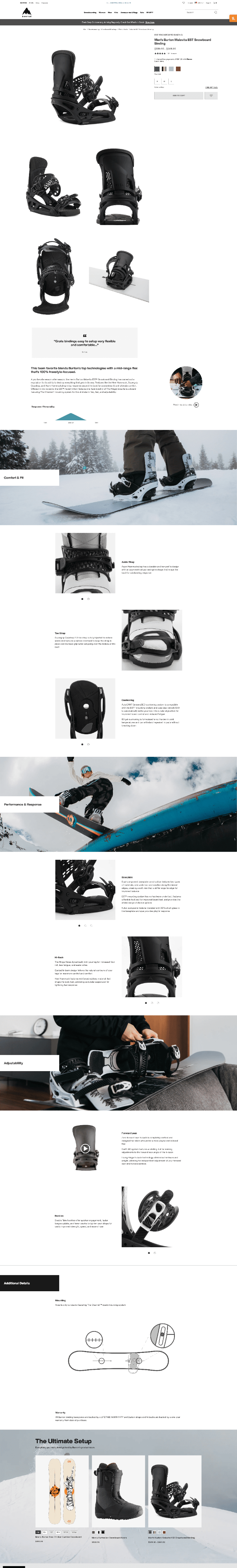
Current PDP Templates
These are the two current PDP templates on burton.com. As you can see they are two different templates. The bindings PDP lives on its own and is written in a different code language than every other product on Burton.com.

The Problems
-

Accessible Information
Our users are struggling to understand our most critical product information on this page. It is either not close enough to the top of the page. Difficult to understand, or not structured in the most logical information hierarchy.
-

Scalability & Consistency
The current template is not able to be scaled to other products on burton.com creating a lot of extra manual work for our team. And this creates two different experiences between product pages for users.
-

Shopping Ease
We offer a limited number of purchasing options on our current template. User’s need different purchasing options in order to influence their ability to buy. User’s purchasing options also vary by region.

Research & Discovery
Requirement Gathering.
The approach:
Starting with the Dev team we analyzed the components on the current PDP and if/how they could transition to Vue from React.
We highlighted the technical pain points such as product copy and data storage, and have been researching an optimal technical solution.
We then met with Primary Business Influencers. and Daily Contributors to Burton.com and PDPs to review the current PDP templates.
We discussed pain points in the management of PDPs, components we like and don’t like, and net new features they would like to see on PDPs.
User Research
Methodology:
We conducted 50 unmoderated tests on segmented users that match our primary user group, the “Radical Outsiders”. We asked for feedback on our current PDP templates focusing on bindings, technical soft goods, and snowboards.
Product User:
Who is the Radical Outsider?
A leader who continuously seeks self-improvement and does not need external validation from others.
55% male / 45% female
Snowboarding is a big part of their identity
Is a leader and influences their network, and are very social
Looking for the latest and greatest gear to enhance their outdoor experience
Not a deal seeker, but a savvy shopper
They seek individuality and performance support within their products
Engage in: day hiking, mountain hiking, trekking, snowboarding, skiing

User Feedback
-
Personality and Benefit Sliders
The personality and benefit sliders on our current PDP differ from product to product and try to visually convey the most important information about each product to the user.
This is some of the feedback we heard on our current personality and benefit sliders:
“I don't think it required a graph to show that it is in the stiff category- it would be better just to state that.”
“Explaining what each of those mean. Like what soft, medium and stiff means in relation to snowboarding and how it effects how you ride.”
“Further explanation of the soft, medium and stiff. And how those can be different for different people on the same product.”

-
Product Details
This is some of the information we heard from users on our current product details:
“I would keep this the same as far as the information goes. I would just put it more on the top after the colors or at least before the details”
“Just make it more compact. Or the option for more compact, and expand the options that you want to see”


Design Solutions
Image Gallery
-

2-Up image gallery that scrolls to the bottom of the buy block
Including model size data on the images that scroll with the image gallery
-

Ability to play autoplay videos within the gallery but includes a pause button for accessibility requirements
-

horizontal image within the image gallery to promote special images or highlight brand content
Buy Block
-

Upper Buy Block
In the upper area of our Buy Block, we are going to display a few elements:
Breadcrumbs
SEO title - will be suppressed on mobile and displayed on desktop
Product Name
Product Price
Active Promotions
Link to Reviews
In Japan we will also add:
Product ID Number as Japanese users use this piece of information to save products they like
Tax included price
-

Transactional Area
Using images as the color selection in order to better represent the products (as opposed to color swatches).
Added an additional size variant for products, like “short”, “regular”, or “wide” for pants.
Added apple pay and additional information on alternative payment methods
-

Flexible Styling
Horizontal scroll for color selection on mobile to preserve screen “real estate”
Maintaining brand colors and fonts for Burton’s sub-brands like Anon and MINE77.
Buy Block - Button Logic
We used color to signify the action of “transaction”.
If you can purchase immediately, the button color is our brand “Jake Blue”, if you can pre-order the product, Jake Blue is also used to signify the transaction that is being placed but is used in a different way.
Otherwise, we stick to a monochrome color scheme to signify that the user can not make an immediate transaction for this product.


Personality and Benefit Sliders
Technical Soft Goods
Our technical soft goods include the most in-depth benefit sliders. Warmth and Waterproofing are two details that are actually measured on a scientific scale. These scales are measured on different point values, so percentages were the best way to represent the values equally.

(Current Template)

(Solution)
Snowboards
Personality sliders really were created in order to talk about snowboards. It is difficult to describe to a new rider how different shapes, materials, and board lengths affect your riding experience. Speaking of it in terms of personality and terrain helps to simplify to complex.

(Current Template)

(Solution)
Product Details
Our current product details section creates several technical hurdles for the team. The #1 pain point is that each product detail is mapped to an image, resulting in a non-scalable template for all products and creating excess management for our data team.
The Solutions:
Detach the details from the images
Utilize a bulleted list to consolidate information and reduce scrolling
working to optimize product copy

Content
In order to incorporate more brand stories, custom product content, and promote marketing opportunities, we added the ability to add custom content modules in two locations on the page.

Next Steps
-
Quick Shop
Add the ability to purchase other products without leaving the page
-
Wishlists
Optimize our wishlist functionality on the PDP
-
Fit Finder
Add the ability to find the perfect fit through a fit finder tool